
Magic: the Gathering revolves somewhat around its basic lands, and makes use of some exceptionally lovely artwork. The five basic lands provide a convenient framework to slot ideas into, so here we have a bunch of things that I drew with the graphics tablet.
Forest
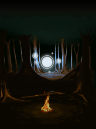
This was my second attempt at a card image. I went through several different compositions involving a forested hillside and odd perspectives before settling on this dark and mysterious scene. The hillside stuff was all done with the mouse on the laptop, but once I got hold of a graphics tablet I ended up choosing a much richer scene. I was inspired by some existing fantasy art here, starting off with bright light from the back and working towards the front. The final outcome is quite different from what I'd originally imagined, much more twisted. The campfire was inspired by a lovely image that evoked a sense of the wilderness.
The card composition uses a leafier green than the image itself for the borders, but a softer green for the symbol. The green mana symbol is quite a distinctive shape from all sides, so there's plenty of room to play around. I came up with the card layouts over Christmas in Inkscape, they're all fixed on a millimetre grid and they use the MgOpen Cosmetica font.
Island
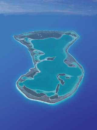
I started getting really serious for the island picture, created with the GIMP and the graphics tablet. The source material was a striking image of Aitutaki, which I used as a reference to create the combination of beaches, reefs and vegetation. Colours were picked from the source image to create a simple palette, and the drawing was built up in many layers (15 or 20 by the end). The hardest part was getting a good balance of colours and contrasts between the underwater parts and the above-water parts, all mixed in with a fade over the top to create the distance haze. The clouds were created by copying areas from the original source image, stretching and smudging as needed to fit the balance of the image.
For the composition, I ended up with the symbol darker than the surrounding circle. This seems to fit a little better with the overall mood of the card. I'm considering a version of the mountain with a darker symbol to see if that works better too, but I'll keep the one I have for now. Bizarrely, my early proofs of the island are missing the black divider between the image and the bottom bar, and it turns out that it really makes a huge difference, so I fixed that pretty quick.
Mountain
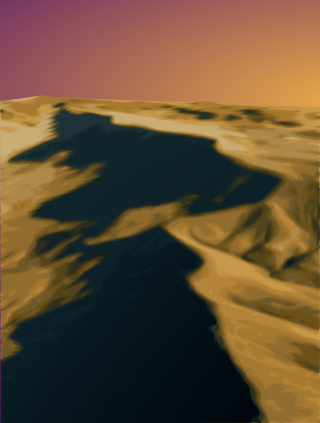
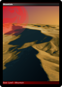
This one was created entirely on a laptop. I processed an existing mountain image with Inkscape, adjusted the results to create a pleasing set of contours and gradients, and exported as a bitmap. Then I used the GIMP's smudge tool to work the colours on the borders between the different regions (this is pretty hard work with a mouse). Finally, the resulting bitmap was imported back into Inkscape to add a nice gradient sky.
In the card frame, the deep colour of the mana symbol pulls the eye across, which is balanced a little by the gradient of the sky. For this composition, it was important to adjust both the sky and the symbol in Inkscape. The effect is reasonable, but the trouble with this particular card is that the detail on the red mana symbol overlaps with busy contrast on the image. I've learned a little from this and tried to reduce the corner detail on subsequent cards.
Plains
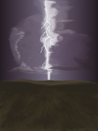
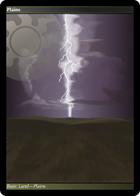
The Plains picture started immediately after the Swamp picture was finished. I was on a roll and I was off from work on holiday to catch up on all my projects, so it seemed like a good idea to try to finish things off. I stumbled across a fantastic image of a storm that inspired this piece, and I tried very hard to capture the concept of a small but powerful storm rolling across the plains by combining it with other material. While the subject matter is pretty striking and works well on paper, I feel that the stormclouds themselves could use more contrast - they're pretty washed-out in the bitmap from my various attempts to get the colours to look right. Of all of the images, this is the one that I'd like to work on some more rather than starting again with a new composition.
Once it's placed in the card frame, though, the picture does seem to work pretty well with the mana symbol and the contrast issue isn't quite such a big deal on the print-out, although it's still not ideal. It gives it a pastel-like quality, in a way.
Swamp
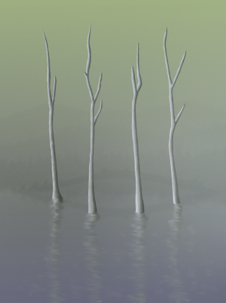
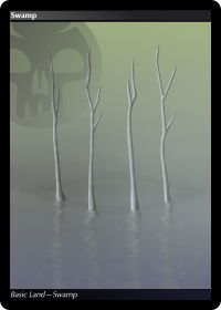
This picture took me a long time to bring together. I had the basic idea of spindly tree shapes in front of other trees in the distance, and found a lot of source material of the right kind of shape for inspiration, but as always I was stuck for a composition that I could see my way to finishing. Trees are hard! In the end I got into the idea of there being something hiding in the mists. The mist is actually built up by masking a misty bitmap extracted from various source materials that's set to multiply mode. This gives a lot of control over the shape without having to worry about the texture. The looming spiky something is drawn in the same way. The main reflection was built up with the displace filter using a suitably modified ripple image, followed by smudge and clone and another layer on top that fades in, set to hue mode, to liven up the reflections a little more.
On the card, the black mana symbol really works well with the murky colours of the image. I think this is by far my favourite of the set, overall. My only concern at the moment is that my printer bands quite a lot across the image so the subtleties are lost in the printed version that I have. I think I need to find a more reliable print method.
