
Many of us remember educational videos that we were shown at school - the one I recall best had someone gingerly dropping a grain of cesium into a very study dish of water from behind an even sturdier blast screen. A while back, there was a short TV series here in the UK from Peter Serafinowicz called "Look Around You" which parodied these shows. We thoroughly enjoyed this show, and when I was thinking of cool gifts to make for people, I was struck with the idea of reproducing one of the memorable props from Look Around You, the Danger: Helvetica sign. I won't spoil the show by trying to explain why Helvetica might be dangerous, so if you haven't seen it, you'll just have to trust in how awesomely funny it is.
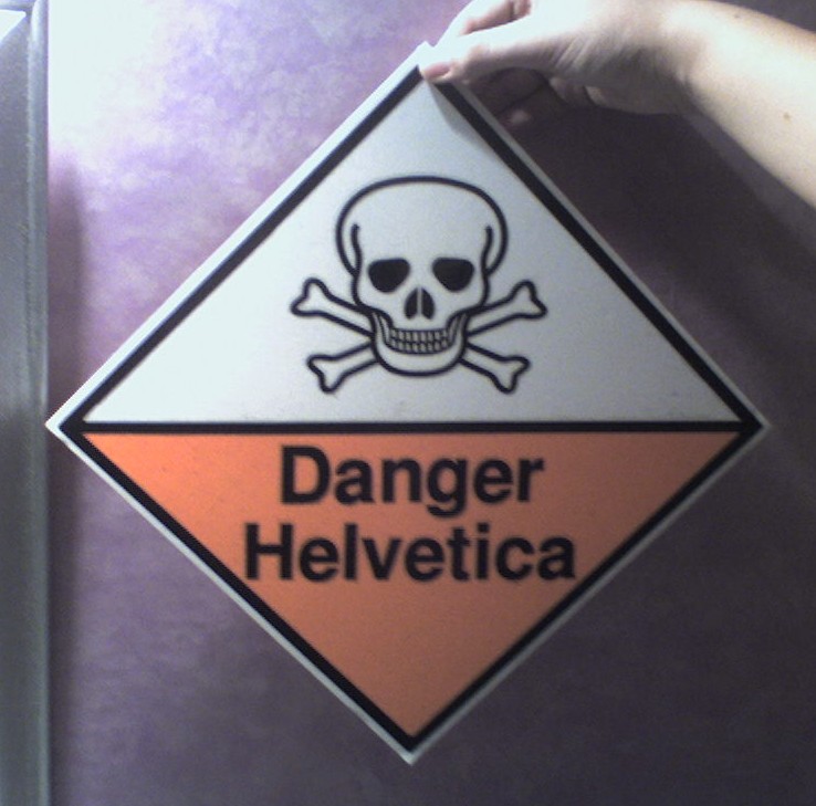
I started off with some Inkscape work to put together the layout, using a public-domain skull-and-crossbones symbol. I fiddled the PostScript to use my printer's built-in fonts to get actual Helvetica to appear, rather than some substitute, as the substitutes lack the distinctive character of the font and it would just be wrong to have an imposter for this piece.
For the construction, I used a piece of A3 foamboard trimmed to a square, then masked and sprayed on the orange colour - it's just the standard orange spraypaint that you get at the craft shop. The black border is made by trimming an A3 plastic pocket to the right shape and spraying it with black paint, then spray-mounting it onto the foamboard. The lettering and symbol were produced in a similar way; printed onto A4 paper, spray-mounted onto old OHP transparencies, carefully cut out (I ended up using a needle file for the fiddly bits) and then sprayed black and spray-mounted onto the board. They look a lot more wonky in the photo than they are up close, but I'll admit that it isn't perfect - an extra stencil would have been good here as a guide. To finish, the piece is covered with transparent sticky-backed plastic for protection on the front, and some sturdy card on the back to cover the areas that accidentally got a bit too sticky.
Overall, the end result came out rather well. It was an awful lot of effort to get it together, but I'm glad that I took the time to get it to work.
