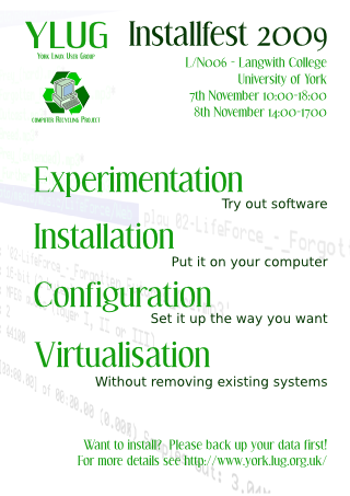
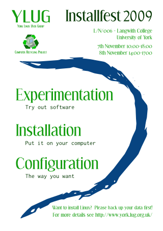
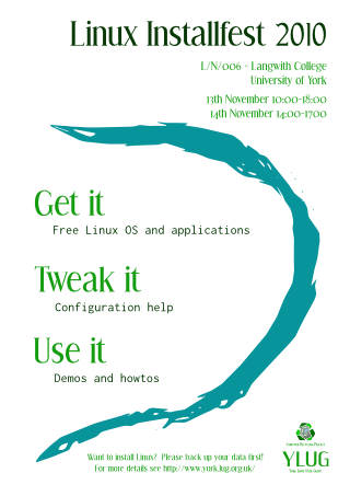
For some years now, York Linux Users' Group has held a yearly Installfest. To help advertise this, they distribute posters. I was heavily involved with the Installfest in late 2000s and produced a series of poster designs over the years. There's a definite style emerging.
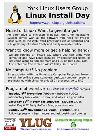
When I first got involved with the advertising, it was a pretty pedestrian and informative poster, the kind you might get at an academic poster session. Needless to say, we didn't get a lot of interest directly from the posters.
Sometimes you get an idea for something, and it seems so great in your mind, yet when you come try it out you find that it isn't really practical. The right thing to do at this point is of course to rethink the essence of what you're trying to do, take it apart and find something that fits the constraints. The ability to do this comes with experience; without it, you end up cramming it all together and going with it regardless.
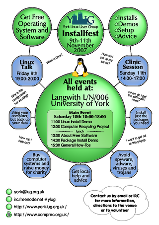
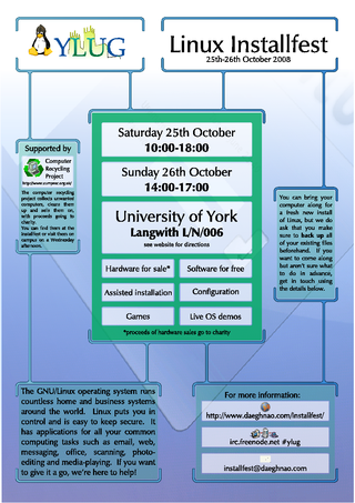
Inspiration struck again, and this time the end result was way cleaner than the previous attempts. The only real issue we found is that the green and blue colour palette makes it look like it's had all the colour bleached out of it by being sat in the window for ages, which isn't conducive to attracting attention. A new colour scheme is planned for 2011...
